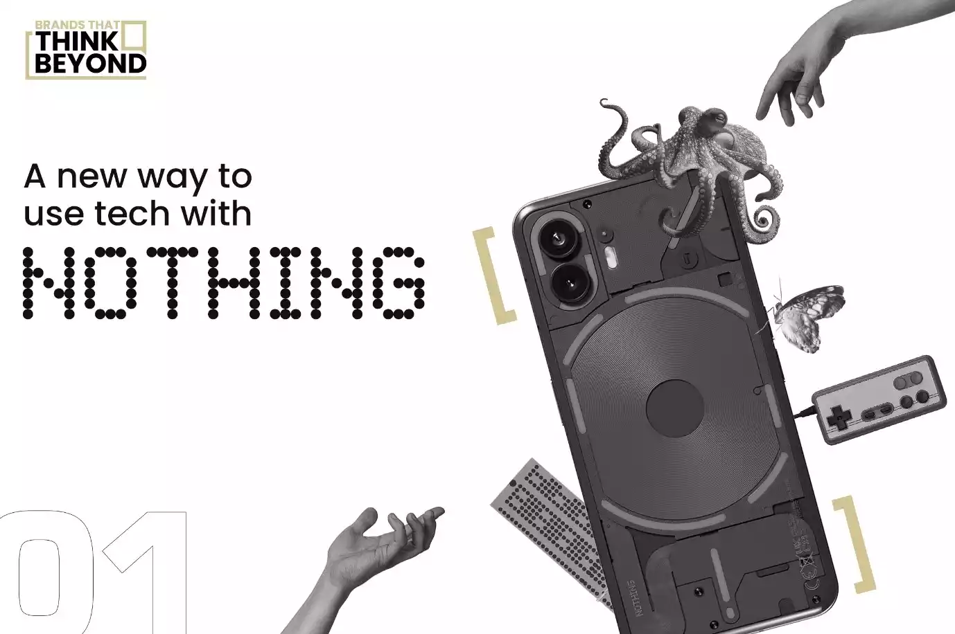
- Hardik Tippannawar
How Nothing redefined the smartphone space with a transparent and innovative brand
The Android vs iPhone war was stale and the lack of innovation was evident. During the pandemic, concerns about reliance on smartphones and it’s health effects were also rising. The documentary “The Social Dilemma” confirmed many of these fears, and the terms “phone usage” & “phone addiction” saw an uptick in Google searches during this time.
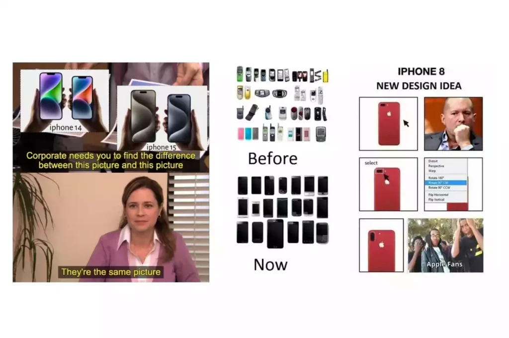
Users were not satisfied with the limited choices and lack of innovation. There were even memes about this discontent, reminiscing the pre-Apple & Android era.
Nothing brought a promise of a fresh perspective and an alternative way of doing things.
Nothing's Big Idea: Tech Should Be Fun, Not Frustrating
Nothing’s brand philosophy centres around a few key ideas. They want to make technology more human and intuitive, stripping away complexity and focusing on seamless, joyful interactions. They aim to “make tech fun again” by offering unique features that encourage users to engage with their devices differently.
They emphasize their independent spirit and close-knit community, positioning themselves as a brand for those who want to embrace something different.
Who Knew Retro Could Be So Cool? Nothing Did.
Nothing’s unique design language, whether it was through its logo or other visual communication, brought old school tech to life.
The dot matrix prints of the IBM mainframe from the 80s were moulded into the Nothing font. Their emphasis on nostalgia and the analog aesthetic was evident through the greyscale palette. Nothing managed to build hype through its design, teasing its visual identity, without even a product in sight.
Their philosophy is reflected in their minimalist design aesthetic, which favours natural shapes and transparency to create a sense of minimalism and connection.
This visual identity is seamlessly applied to Nothing’s product line. The packaging features the dot matrix type, placed against a matte black material, further emphasising the analog roots of its design language. The product literature & boxes for accessories, all echo the nostalgic aesthetic beautifully.
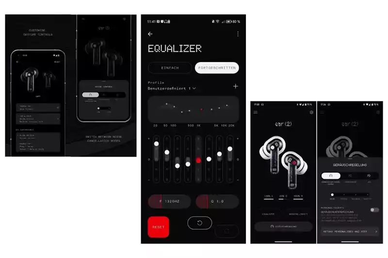
The companion app to the ear (1) prominently featured the dot matrix font and a minimal user interface, hinting at the direction the Phone (1) would eventually take.
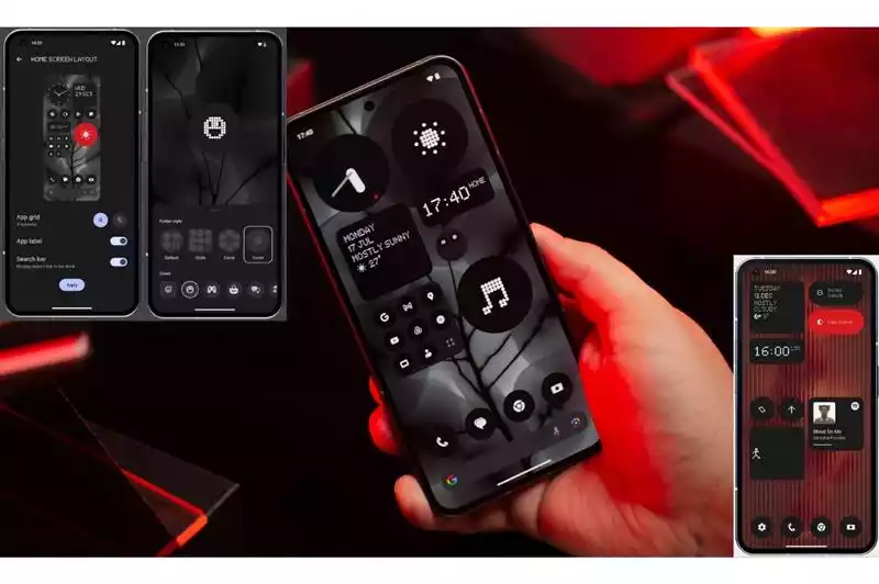
When the Nothing Phone (1) was finally released, the OS boasted the same dot matrix font, a greyscale UI & icons. This removed all the pitfalls that came with a colourful and animated interface that encourages users to spend as much time as possible on their phones.
Something out of Nothing: Where Philosophy Meets Product Design
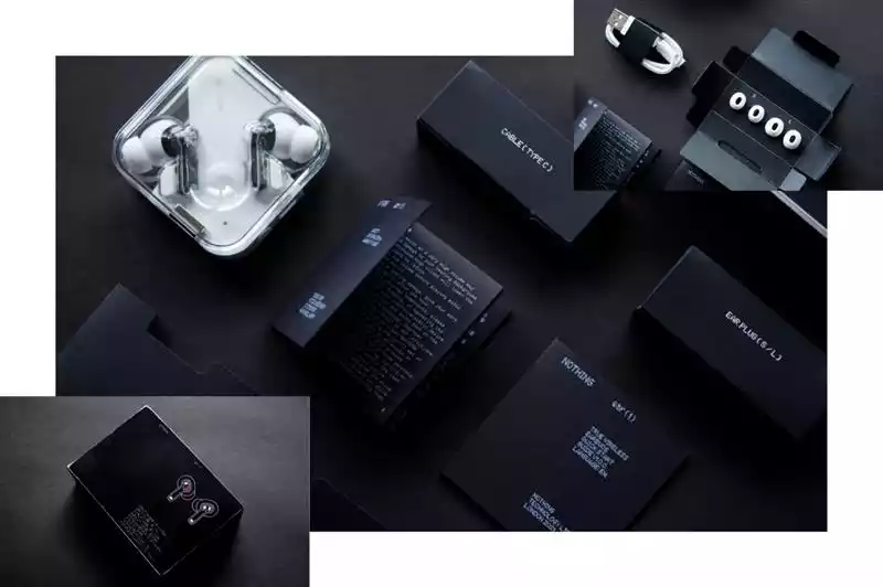
The ear (1) perfectly reflects Nothing's minimalist design philosophy.
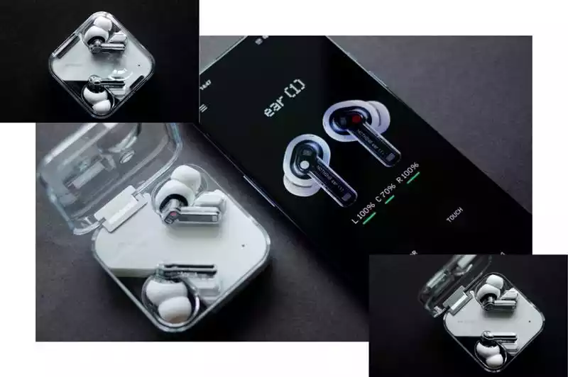
The transparent earphone case, enables users to see components that are usually hidden. The case features a dimple in the outer shell, making it easy to handle and pull out of one’s pocket. This attention to detail ties back to Nothing’s philosophy of innovation, solving the problem of charging cases slipping and the buds “flying” across the room. The carefully designed dimple also makes sure the buds stay in place, eliminating the problem of loose contact points that make other earphones useless after some time.

As opposed to the usual printed or debossed “L” & “R” markings, the buds feature a simple red dot printed inside the bud, solving another problem of the marks fading with time.
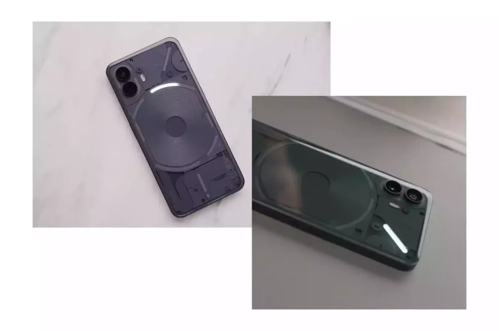
The transparent plastic material from the ear (1) made its way into the smartphone’s back panel. This provided a new surface that was previously untapped. Where their competitors saw an opportunity to add more screens to the back panel, Nothing instead used it to reduce screen usage instead.

The glyph interface provides a better way for users to interact with their phones. The priority notification light meant users wouldn’t check their phone for every mundane and useless notification. Glyph timer and integration with delivery and ride-hailing apps added another layer of protection from doomscrolling.
In a World of Noise, Nothing Whispers (and Gets Heard)
Nothing’s visual brand also stood out in marketing. Whether it was social media, ad films or OOH, with minimal and direct representation of the product, careful curation of photography and concise copy, Nothing stood out.
Instead of an emphasis on colour gradients, hyper-realistic 3D environments and flattering images of the product, Nothing applied it’s minimal and straightforward visual language. Their social media was populated by the same white and black colour palette with a sparingly used red, prominently featuring the phone against a solid white background.
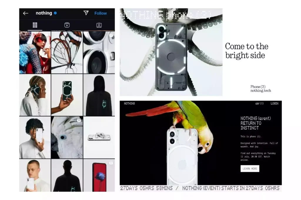
Their ads placed the phone front and centre against a black or white background, making it the focal point. Alongside minimal copy in a sans serif font, this made sure it was not inundated with features and jargon.
Any pops of colour were reserved for creatures interacting with the products. A parrot symbolizing communication and vibrant individuality, a beetle for durability and strength, or an octopus for adaptability and intelligence, these motifs create a sense of wonder and invite viewers to explore.
This approach allows Nothing to connect with audiences on an emotional level, sparking curiosity and creating a memorable brand experience.
The CEO Who Became an Internet Sensation

Carl Pei, the Founder, became the face of Nothing by interacting with users, reacting to reviews by tech influencers, and a message of exploration and innovation.
Nothing especially became a crowd favourite before the launch of the Phone 2a. Following a brief exchange with an Indian user, Carl changed his “X” username to “Carl bhai”, further prompting many Indian brands to try and share the limelight.
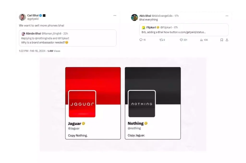
Nothing’s recent spin on Jaguar’s rebrand maintains this unique tone of voice.
Nothing’s brand was further cemented with a consistent message through Carl Pei’s online presence. Not only reacting to reviews by tech influencers, Carl himself started reviewing phones from his competitors. In one of these videos, when he admitted to a minor oversight and promised to fix it going forward, the transparent and approachable side of Nothing was undeniable.
When Fans Become Creators: Nothing's Community Magic
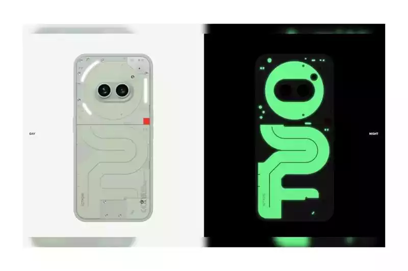
Nothing went beyond the basics to truly engage the community by releasing a limited-edition phone built entirely by members of the community, including the hardware, wallpaper, packaging and, even the campaign. The Community Edition, with its limited availability of 1,000 units was a success, adding another feather to Nothing’s community-friendly cap.

Recently, Nothing also added a widget that brought the nostalgic snake game back to life, designed by a community member.
With Carl Pei recently announcing that their team is exploring building a new OS from scratch, and the latest OS 3.0 update, paint a promising future for Nothing’s mission.
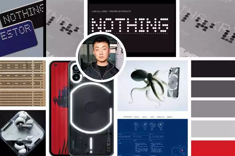
The Nothing Story: A Lesson in Brand Building
Nothing’s journey has been nothing short of remarkable. From a bold entrance with its earbuds to the recent sister brand CMF, the brand has consistently challenged conventions. Their philosophy resonates throughout their product as well as their brand, emphasizing intentionality over excessive features.
But Nothing’s success isn’t just about minimalist aesthetics. Their transparent communication, consistent brand personality, and genuine engagement with their community have fostered a loyal following. By understanding their audience and daring to be different, Nothing has captured the imagination of consumers worldwide.
Ultimately, Nothing’s story reminds us that in a saturated market, authenticity and a strong brand identity can be powerful differentiators.
-
Content that rocks the world
06 November, 2020 -
Design: Bringing Ideas to Life
12 November, 2020 -
Whassup Bud: One of Budweisers’ Evergreen Television Ad Campaign
20 November, 2020 -
Brands must be Gods
27 November, 2020 -
The Deffective Dictionary
08 January, 2021

