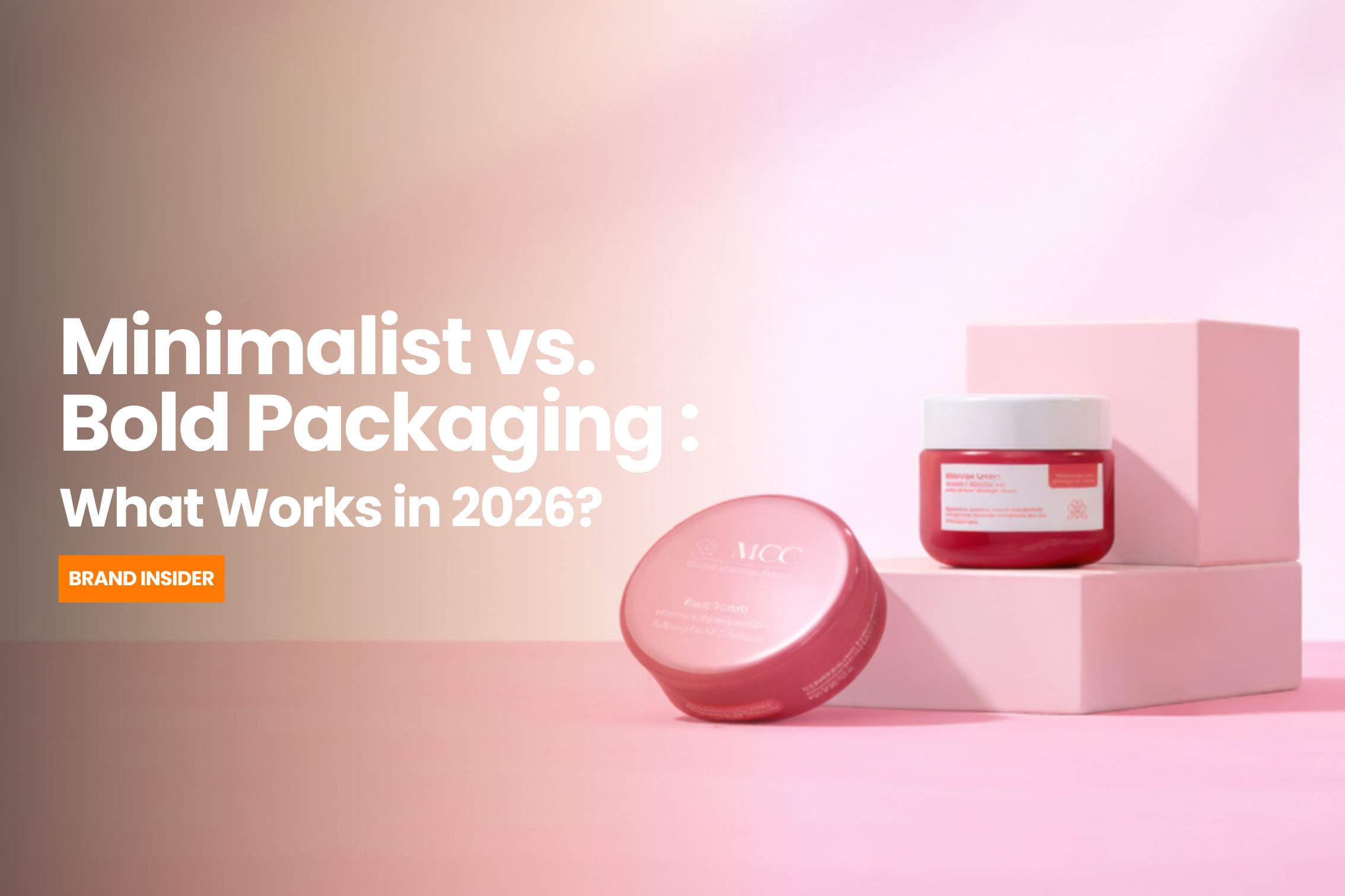
Minimalist vs Bold Packaging : What Works In 2026

- Avantika Bharad

Packaging is no longer just functional. It’s strategic. 

In 2026, the first brand interaction often happens before a product is used, when you see it on a shelf, in a quick-scroll reel, or in an unboxing video. Packaging has become a communication layer, a positioning tool, and in many cases, the deciding factor.

So the real question isn’t minimalist vs bold.

It’s : what works, when, and why? 

This blog explores how both styles perform today, and how brands should choose between them with intention. 

Why Packaging Matters More Than Ever 

Attention spans are shorter. Choices are endless. 

Which means packaging has one job :

Get noticed. Get understood. Get chosen. 

But there’s tension. 

Minimalist packaging signals calm, confidence, and premium positioning. Bold packaging signals energy, personality, and immediacy. 

Both can work. Both can fail. 

The difference lies in context. 

What Minimalist Packaging Does Well 

Minimalism is not about less design. It’s about controlled design.  Minimalist packaging typically uses limited color palettes, clean typography, negative space and subtle branding.

Where It Wins in 2026 

1. Premium positioning
Minimal design signals confidence. It implies the product doesn’t need to shout. 

2. High-trust categories
Skincare, wellness, tech - categories where clarity and calm matter. 

3. Visual fatigue environments
In crowded shelves or noisy digital feeds, simplicity stands out.

Where It Fails

Minimalism fails when :

  1. It looks generic
  2. It lacks distinctiveness
  3. It removes too much personality

Clean is not the same as memorable.

What Bold Packaging Does Well 

Bold packaging is built for attention. 

It uses vibrant colors, strong typography, playful layouts and high contrast.  

Where It Wins in 2026 

1. High-competition categories
Snacks, beverages, D2C brands - where differentiation is critical. 

2. Youth-focused audiences
Boldness signals energy and cultural relevance. 

3. Social media visibility
Bright, distinctive packaging performs better in digital-first discovery. 

Where It Fails 

Bold packaging fails when : 

  1. It feels chaotic  
  2. It lacks hierarchy  
  3. It sacrifices clarity for noise  

Attention without clarity doesn’t convert.

The Real Shift in 2026 : Hybrid Packaging 

The smartest brands aren’t choosing sides. 

They’re combining both. 

Minimal base. Bold accents. Clean structure. Distinctive elements. 

This creates : 

  • Clarity + recall  
  • Premium feel + personality  
  • Shelf presence + brand depth  

The shift is strategic. 

How Brands Should Choose Their Packaging Style

Instead of asking, “What looks better?”, ask : 

  • What category are we in?  
  • What does our audience respond to?  
  • What does our brand stand for?  
  • Where will this product be discovered?  

Packaging is not decoration. 

It’s positioning in physical form. 

The Crewtangle Take 

Minimalist packaging says : “We’re confident. We don’t need to try too hard.” 

Bold packaging says : “Look at us. We belong in this moment.” 

Both are valid, only when aligned with the brand intent. 

At Crewtangle, we believe the best packaging doesn’t follow trends. 

It reflects clarity. 

Because in 2026, the brands that win are the most intentional.