JaGUar’s Logo Rebrand: The Cat That Leapt Into Uncharted Waters
When a brand known for roaring decides to purr, does it lose its bite—or is it simply sharpening its claws for a new era?
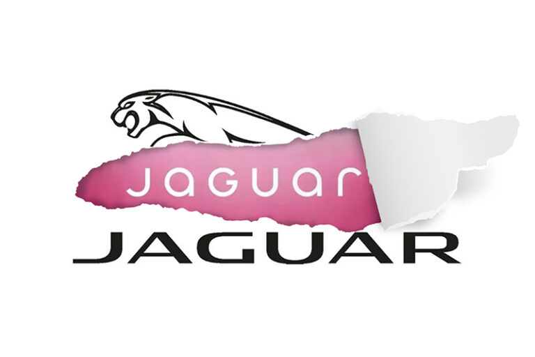
Jaguar, the symbol of ferocity and finesse, has changed the direction of its iconic leaping feline, now moving forward. Unveiling a logo branding as sleek as it is controversial. Aimed at electrifying its image for the all-digital, all-electric Gen Z and Millennial crowd, the move has left both design enthusiasts and loyalists prowling for answers. At Crewtangle, we’ve got plenty to say about it. Let’s sink our claws into what this bold new design really says!
The Design: Minimalism with a Roar
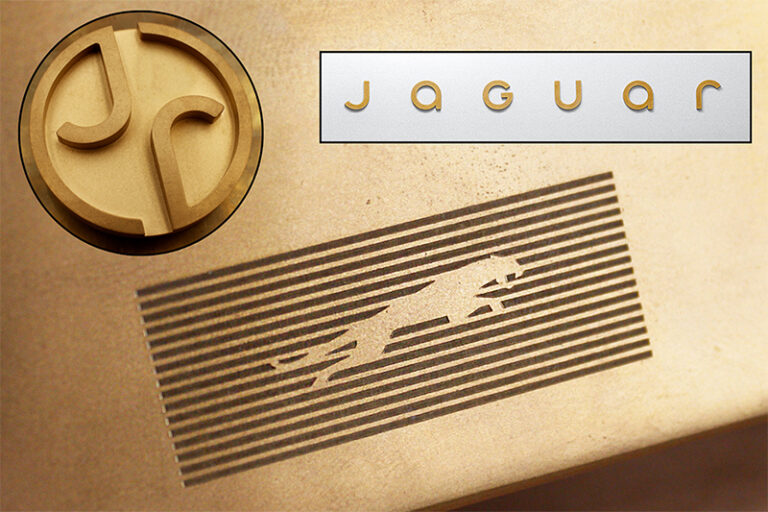
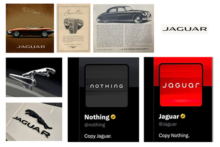
The leaping Jaguar has changed direction. The minimalist wordmark—’JaGUar’—a curious mix of upper and lowercase letters feels part futuristic, part unsure of itself. Gone are the days of literal representation of logos, but what does this mean for a brand synonymous with dynamism?
From a designer’s lens, this logo branding screams “sleek,” but also whispers “safe.” The sans-serif font is clean, modern, and undoubtedly a nod to the tech-forward ethos of the times. Yet, one can’t help but wonder—did Jaguar trade its roaring charisma for the kind of neutrality you’d expect from a direct-to-consumer startup? It’s like watching James Bond swap his Aston Martin for a… well, electric scooter.
The muted color palette furthers this point—monochrome simplicity that feels corporate-cool but lacks the visceral luxury of Jaguar’s heritage. A silver gradient here, a shadowy highlight there—it’s polished, sure, but does it evoke the pulse-quickening thrill of a V8 engine or the aspirational allure of luxury? The answer feels murky, like a Jaguar caught between lanes.
The Video: Purring or Roaring?
Ah, the logo branding video—the pièce de résistance.
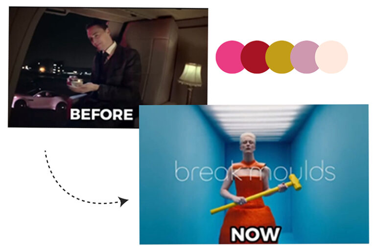
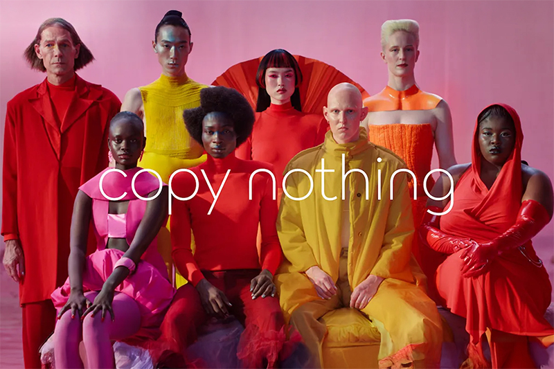
Or at least it should have been. Instead of showcasing the rich heritage or a glimpse of the electric future, the promotional material feels oddly generic. No car visuals, —just an abstract, overly conceptual representation of something. And those colors? Unfit for a brand steeped in luxury—muted tones that lack the richness Jaguar is known for.
If this video were a student at a design critique, the feedback would likely be: “Nice vibes, but what’s the story?” The absence of actual Jaguars (cars or cats) feels like a missed opportunity. This isn’t a fast fashion logo branding; this is Jaguar.
Who’s the Audience, Anyway?
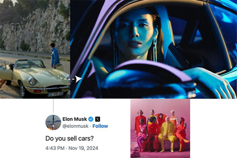
Here’s the thing: younger audiences have always admired Jaguar for its unapologetic luxury and timeless aesthetic. Jaguar has always been a symbol of wealth and exclusivity—owned by the elite, driven by those who’ve made it, not those still climbing. It’s a car that reflects power, status, and success. Yet, the logo branding video shifts focus to a younger, tech-savvy audience, raising a crucial question: can they even afford a Jaguar?
Even Elon Musk chimed in, subtly questioning the luxury brand’s new direction. For the affluent class—those who see their cars as a portrayal of their richness—does this new image, still resonate? Or does it dilute the exclusivity that made Jaguar aspirational in the first place? The disconnect is glaring. Luxury doesn’t beg to be noticed; it demands respect. This shift feels like a brand trying to fit in when it should be standing out.
The "Nothing" Controversy: When the Cat Lost Its Roar
“Jaguar’s new logo? Looks like they hit Ctrl+C on Nothing’s design and Ctrl+V on their rebrand,” one comment read, summing up the internet’s sass. And let’s be honest, the similarity is hard to unsee. The big cat’s leap into minimalism has left some wondering if it’s a creative stroke of genius or just playing it safe in the age of sleek sans-serif trends.
From a designer’s seat, it’s easy to see the intent. Jaguar wanted to break free from the past and embrace the future—a future electric, young, and tech-driven. The clean font whispers modern luxury, but for a brand that once roared unapologetically, the tone feels quieter than expected. Elite brands shouldn’t ignore their history.
The consumer perspective? Nostalgia is hard to overwrite, and for many, Jaguar’s logo wasn’t just a design—it was an identity. Reimagining the logo has sparked a sense of loss for some, but others see it as Jaguar leaping boldly toward the future, as if the brand left behind the power and pride that made it aspirational.
Was it bold? Sure. Was it risky? Definitely. But in the world of luxury and reinvention, controversy is sometimes the price of progress. So, is this logo rebranding a brave leap or a copycat misstep? You decide. Either way, one thing’s clear—Jaguar’s purr still knows how to make noise.
The Verdict: A Leap Too Far?
But there’s always the risk of regret when you see the final look. Jaguar’s new branding is not without merit—it’s clean, modern, and positions the brand as forward-thinking. But for a legacy like Jaguar’s, “clean” might not be enough.
That said, legacy lovers might still find themselves wondering: does this new look have the same aspirational pull? Is it still the Jaguar they dreamed of parking in their driveway someday?
Leaving It to You
Rebrands are, at their core, about evolution, and Jaguar has chosen to evolve boldly. Whether you see it as a leap into the future or a departure from tradition is up to you. As creatives and customers, we’re left with the reminder that change is constant—so why shouldn’t a brand as dynamic as JaGUar embrace it?
At Crewtangle, we believe Jaguar’s logo branding is a bold move, one that has changed the direction of its iconic leaping feline, now moving forward. So, what’s your take—sleek reinvention or a step too far? After all, if change is the only constant, perhaps reinvention is the ultimate roar of progress.
- Harshleen Israni
-
Content that rocks the world
06 November, 2020 -
Design: Bringing Ideas to Life
12 November, 2020 -
Whassup Bud: One of Budweisers’ Evergreen Television Ad Campaign
20 November, 2020 -
Brands must be Gods
27 November, 2020 -
The Deffective Dictionary
08 January, 2021

