- Shreshtha Agrawal
Within Our Orbit Lies a North Star—To Move People Through the Wonders of Sport
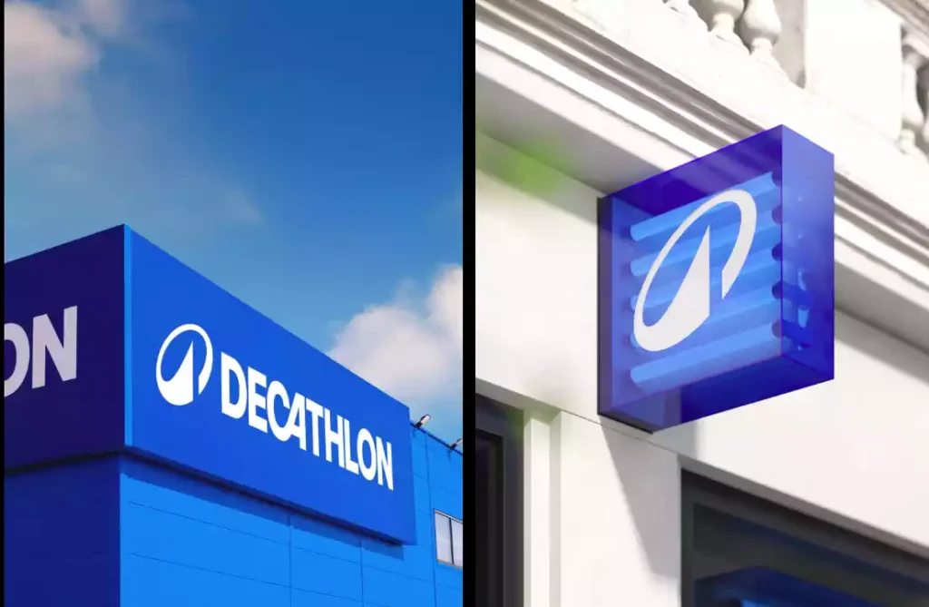
Decathlon’s rebranding journey in 2024 is a bold pivot that speaks not only to its history but also to its vision for the future. As a branding agency, we see this as more than just a logo change—it’s a strategic statement. The introduction of their first-ever logo, L’Orbit, encapsulates the ideas of movement, inclusivity, and sustainability, setting the pace for an evolving sports world.
Sticking the Landing Since 1976
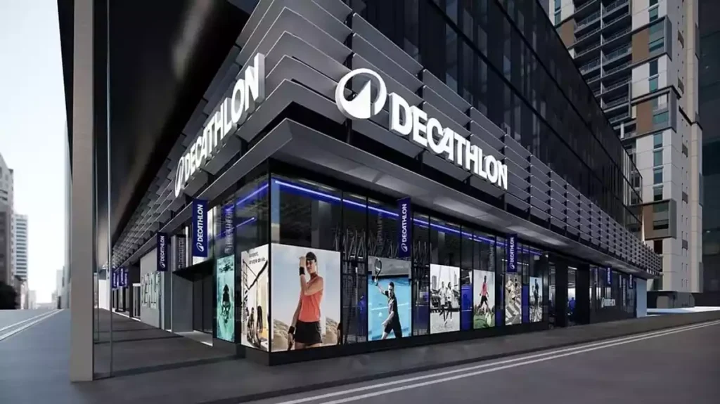
Since its inception, Decathlon has excelled in making sports accessible to all. From its iconic blue wordmark to its reputation for quality and affordability, Decathlon has played in the big leagues for over 1,700 stores and 69 countries. But after nearly 50 years, the shift from a static wordmark to L’Orbit reflects the brand’s drive to stay relevant and resonate with a new generation.
The Orbit: Movement and Meaning in Every Detail


From an agency’s perspective, L’Orbit is a visual metaphor with layers to decode:
- A Structure That Breathes: The open circular design of the Orbit breaks free from the box of traditional logos. This openness reflects Decathlon’s inclusivity, inviting every athlete—from weekend joggers to elite professionals—to find their place.
- The Connected Design: The Orbit’s continuous flow isn’t just for aesthetics; it cleverly balances the tilted A from Decathlon’s iconic wordmark while ensuring the logo remains dynamic. It’s almost as if the A became the heart of a circular motion, now orbiting towards infinite possibilities.
- Functional Spacing: The deliberate letter spacing adds to the sense of openness and accessibility. It’s as though the logo invites you in, with just enough room for interpretation and connection—an inclusive design for an inclusive brand.
A Palette That Plays for Keeps
Colors are not just accents—they’re tools for storytelling. Decathlon’s choice of vibrant blue is purposeful, signifying energy, trust, and accessibility. It’s a color that brings together their multi-specialist offerings, creating a cohesive yet dynamic brand identity that speaks to all levels of athletes.
More Than a Logo: The Orbit’s Purposeful Design

Let’s get technical. As designers, the Orbit’s most fascinating feature is its balance of functionality and symbolism:
- Circularity: This isn’t just a shape; it’s a declaration of continuity. The motion of the Orbit mirrors the cyclic nature of sports—teamwork, practice, victory, and growth.
- Not Just for Show: Without a box, the logo’s design could have felt disjointed. Adding the Orbit—like a supporting net around the elements—creates a sense of cohesion while maintaining movement.
- Multisport Inclusivity: Whether you’re chasing a football, swinging a racquet, or running marathons, the Orbit embodies any sport, any time. Its open form welcomes every game ever played and those yet to be invented.
Breaking the Mold: The Inclusivity of Design

At its core, the new Decathlon identity isn’t just about aesthetics—it’s about values. The open, flowing Orbit is a design masterstroke that reflects Decathlon’s unwavering commitment to bringing sports to everyone. The deliberate openness and modularity of the brand speak to its mission to remove barriers—whether they’re physical, emotional, or economic.
Crewtangle’s Take: Design Done Right
From our agency’s perspective, Decathlon’s rebranding is a showcase of thoughtful design aligned with strategic goals. L’Orbit isn’t just a logo; it’s a story. It’s a reminder that brands evolve, not just to stay relevant but to resonate. Every choice—from the spacing of letters to the boldness of color—feels intentional and impactful.
It’s not just a logo; it’s a calculated risk. Whether it pays off, only time will tell.
-
Content that rocks the world
06 November, 2020 -
Design: Bringing Ideas to Life
12 November, 2020 -
Whassup Bud: One of Budweisers’ Evergreen Television Ad Campaign
20 November, 2020 -
Brands must be Gods
27 November, 2020 -
The Deffective Dictionary
08 January, 2021


