Advanced Color Theory and Palettes for Designers!

- Shreshtha Agrawal

If you’re a Designer, you’ve already worked on multiple creatives, scrolled through social media, tweaked a campaign, or reviewed an ad—and whether you noticed it or not, colour was guiding your decisions. From a high-converting CTA button to a billboard on your commute, colors aren’t just about aesthetics—they’re psychology, strategy, and influence.

But beyond what we already know, What’s new Scooby doo? What are designers, brands, and industries doing with colors that we haven’t explored yet? Let’s dive into the science, history, overlooked colors, and the psychology shaping modern design.

1. The Forgotten Colors: Why Some Hues Never Make It to the Mainstream

You’ve used blue, red, and yellow endlessly—but when was the last time you saw a brand use rich ochre, deep teal, or Tyrian purple? Some colors fade into obscurity due to cultural perception, manufacturing limitations, or even psychology.

  • Vantablack—The darkest material ever made, absorbing 99.965% of light. Only a few artists and brands have used it due to its controversial patent ownership.
  • Tyrian Purple—Once a status symbol of Roman emperors, now too expensive to produce at scale.

If you want a distinctive identity, explore colors that aren’t overused. Deep greens, muted terracottas, and dark violets are making a comeback in luxury and sustainability-focused brands.

2. The Origins of Color: How We Got the Palette We Use Today

Ever wondered where color pigments originally came from? Long before digital screens, designers were literally grinding minerals, plants, and insects to create pigments.

🎨 Ultramarine: Extracted from lapis lazuli, this pigment was once more expensive than gold and reserved for royalty and religious paintings.

🖌 Indian Yellow: Rumored to have been made from the urine of cows fed exclusively on mango leaves. It was banned due to animal cruelty concerns.

🔥 Modern synthetic colors: With the rise of artificial dyes in the 19th century, colors became cheaper and more accessible, leading to mass production of vibrant palettes.

Relevance for designers: Tie your color choices to historical significance. Example: Luxury brands use deep blues and golds because they’ve always symbolized wealth.

3. The Psychology of Colors in 2025: What’s Changing?

While red still means urgency and blue still signifies trust, cultural shifts and generational preferences are altering color psychology.

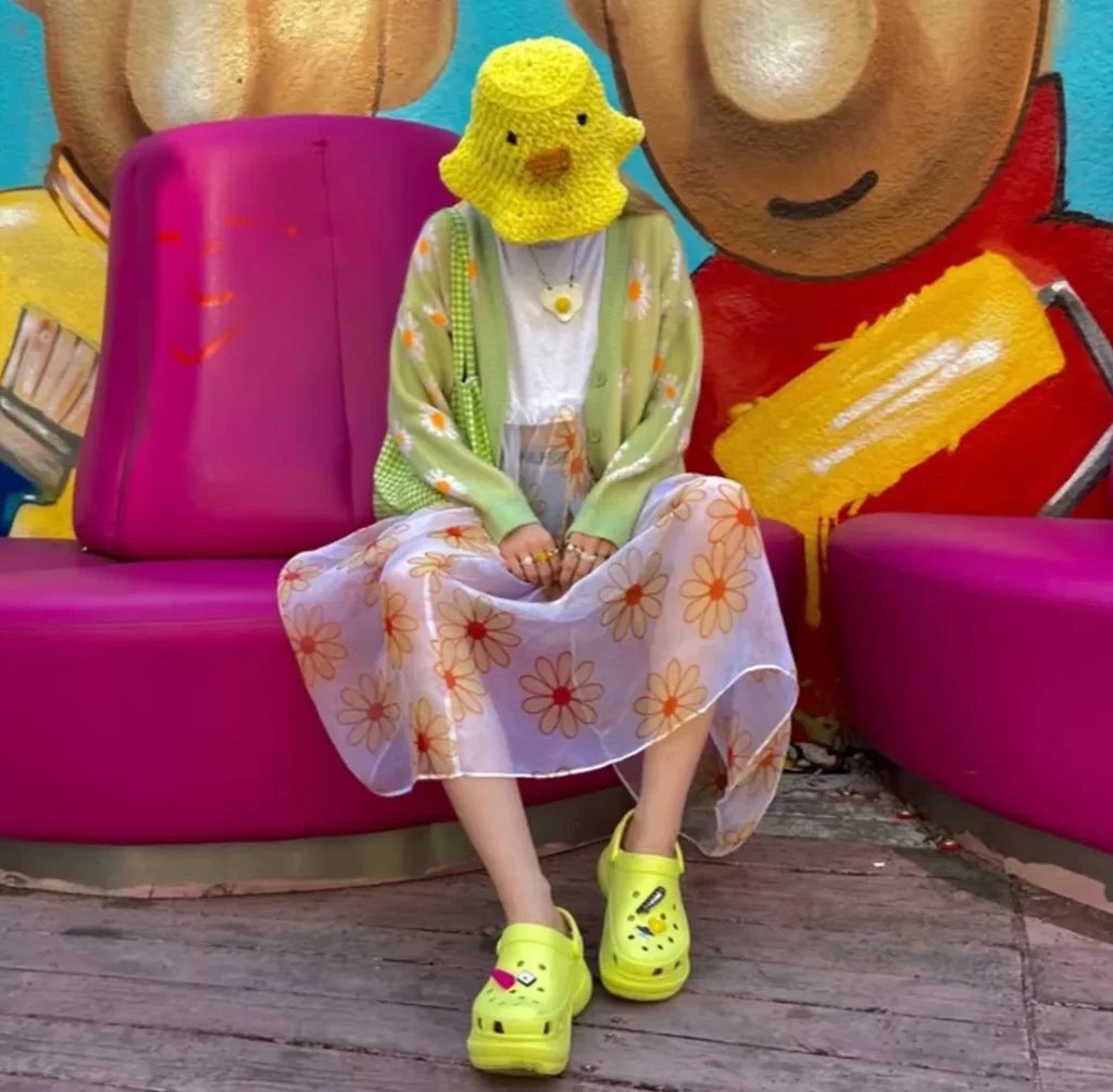
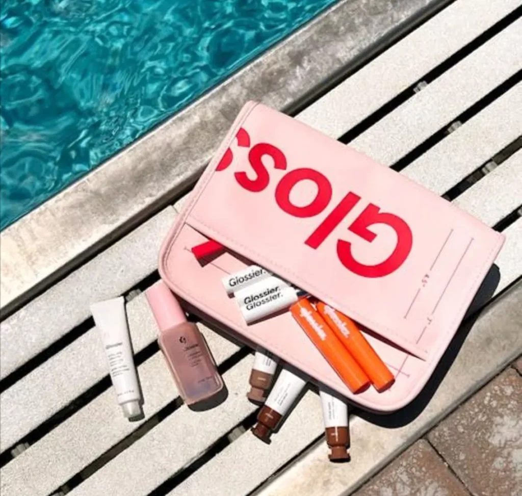
🔹 Neon & Dopamine Colors are Dominating Ads Brands like Crocs, Glossier, and Balenciaga are tapping into vibrant dopamine-inducing hues (hot pink, electric blue, citrus yellow) to appeal to Gen Z’s love for maximalism.

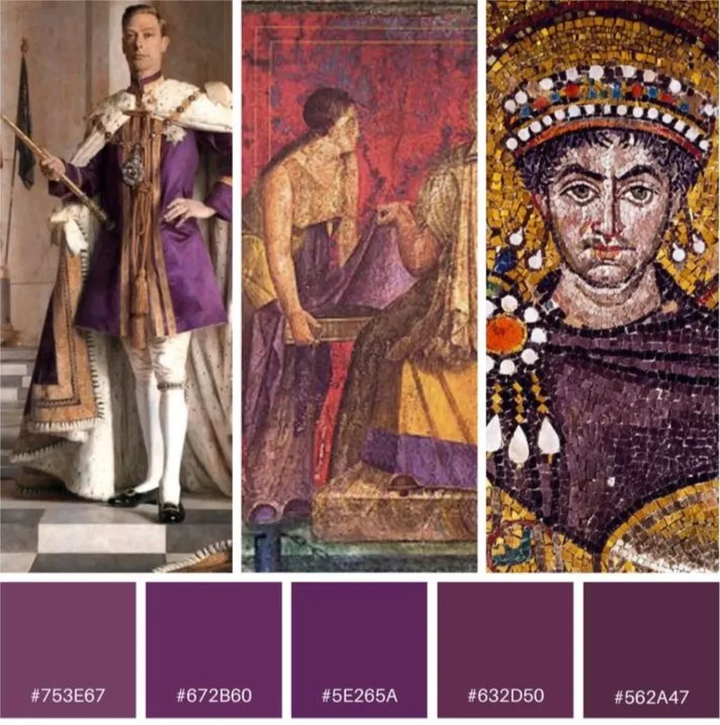
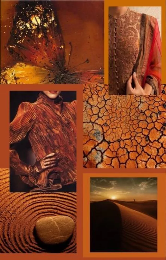
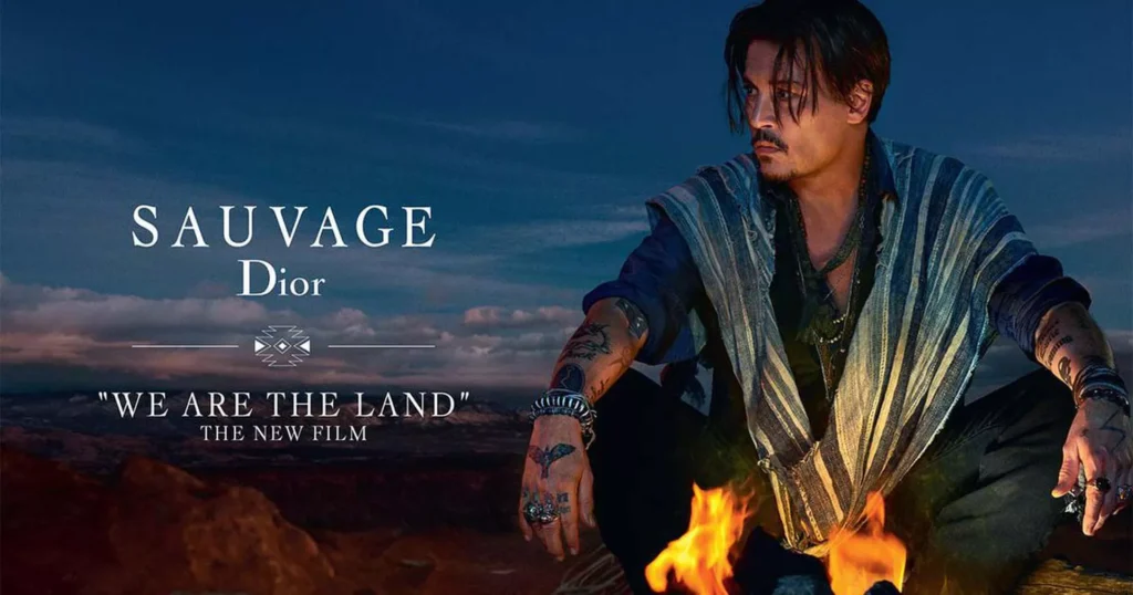
🔸 Earthy Tones & Muted Palettes are Replacing Minimalism Gone are the stark black-and-white minimalist trends. Brands are now favoring warm terracotta, sage green, and ochre to create a more human, organic feel.

✔ Want your brand to feel fresh and future-ready? Ditch the overdone millennial pastels and go for bold expressive colors or nature-driven muted palettes.

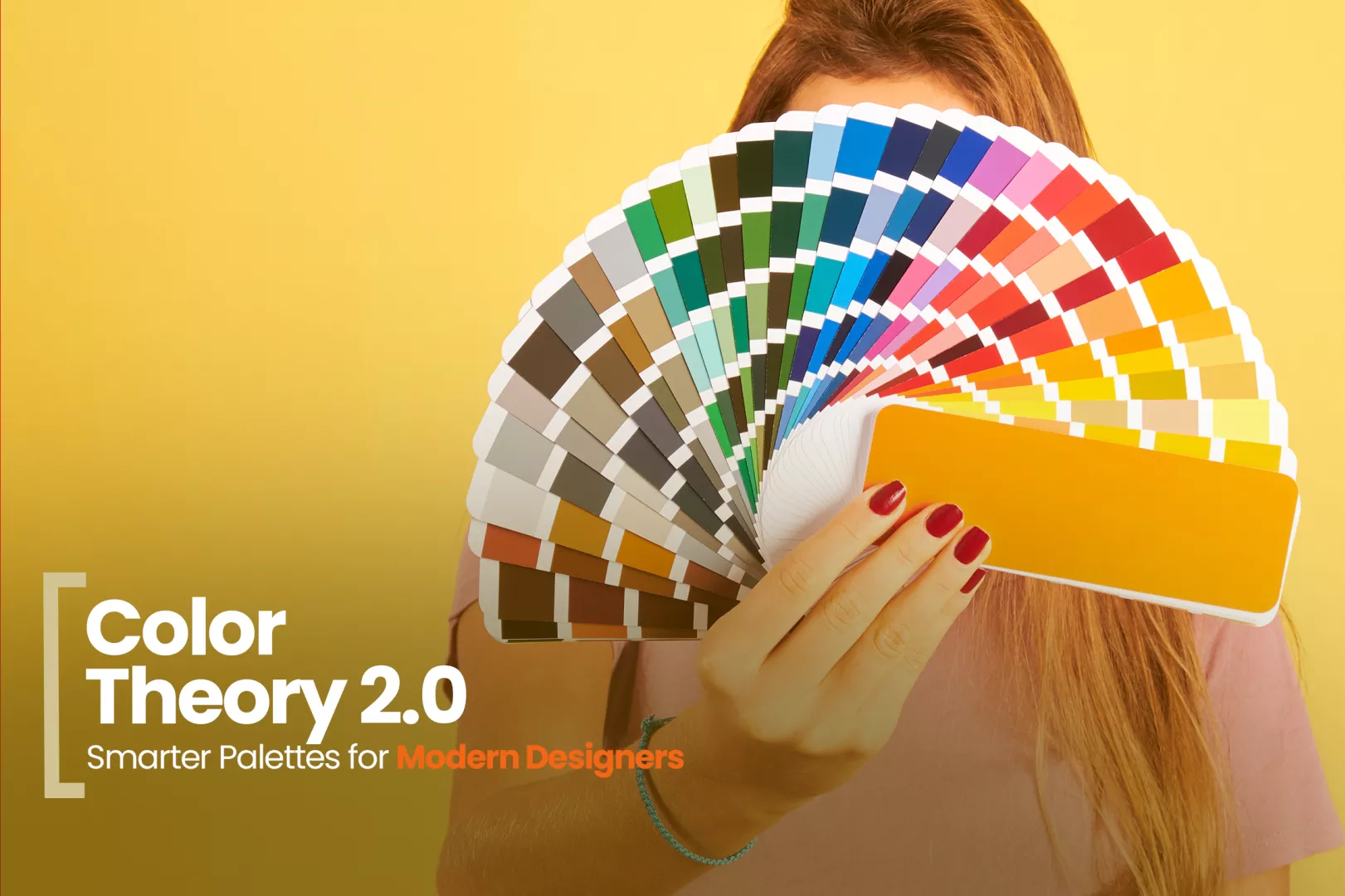
4. The Role of Pantone Colors in Modern Design

Every year, Pantone predicts the color that will shape industries. But how much does this really influence brands and ad campaigns?

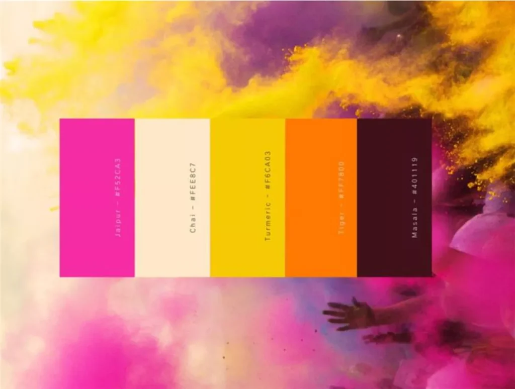
🟤 Pantone 2025 – Mocha Mousse (#A47864): A rich, earthy neutral that embodies warmth, grounding, and timeless sophistication. Used in luxury fashion (Bottega Veneta, Jacquemus, The Row), tech (Motorola), sustainable interiors (Joybird), and high-end packaging.

🟠 Pantone 2024 – Peach Fuzz (#FFBE98): Signified warmth, self-care, and human connection. Used in beauty, wellness, and lifestyle brands.

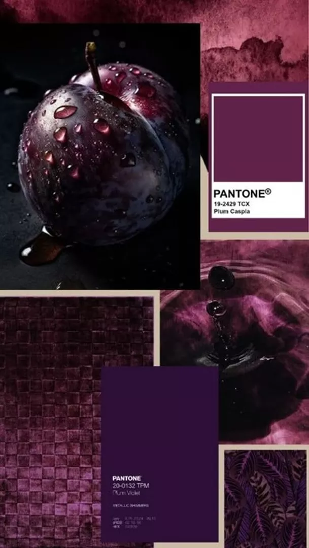
🟣 Pantone 2023 – Viva Magenta (#BE3455): A bold shade symbolizing rebellion, creativity, and gender fluidity. Used in fashion and digital media.

🔹 Although, more brands are breaking away from Pantone trends to define their own seasonal palettes rather than following a singular trend.

Instead of blindly following trends, analyze whether a color actually aligns with your audience’s psychology and the longevity of the trend.

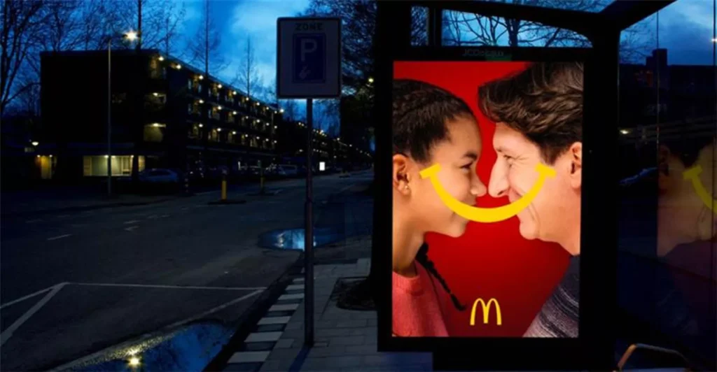
5. How Colors Influence Ads, Digital, and OOH

Why Are Digital Colors Brighter Than Print?

If you’ve ever tried matching a vibrant RGB screen color to print, you know the struggle. Here’s why:

✔ RGB (Screens) = Light-Based → More vibrant due to direct light emission. ✔ CMYK (Print) = Ink-Based → More muted since colors are reflected, not emitted. ✔ HEX Codes = Web-Optimized → Adjusted for digital accuracy but may shift on different displays.

🎭 What Designers Can Do:

For OOH & Billboards → Use high-contrast palettes (black & yellow, red & white) for better visibility.

For Digital Ads → Use dopamine-driven colors (saturated reds, electric blues) for eye-catching performance.

For Packaging & Branding → Natural tones create a feeling of sustainability and longevity.

6. The Future of Color: What’s Next?

🔹 AI-Generated Palettes – AI tools are now suggesting color palettes based on sentiment analysis and cultural trends. Brands are using AI-generated color mood boards to test audience engagement before finalizing color choices.

🔸 Color Accessibility Standards – With digital inclusivity growing, brands are being forced to reconsider color contrast and readability. Expect to see more high-contrast, accessible palettes being integrated into major UI/UX design systems.

Key Takeaways:

  • Use forgotten colors for uniqueness—Teal, ochre, and deep violets are underutilized.
  • Tap into history—Luxury colors like ultramarine blue & gold are tied to wealth and status.
  • Follow psychology shifts—Neons for energy, muted earth tones for warmth.
  • Challenge Pantone trends—Create palettes based on your audience, not just yearly forecasts.
  • Consider accessibility & AI—Future-proof your designs with high-contrast, readable colors.

At Crewtangle, we think that colours are alive, it shifts with culture, technology, and generational trends. As a designer, don’t just follow the color wheel understand why certain colors dominate and how to use them to shape perception.

🚀 What’s the most unconventional color you’ve used in a project? Let’s discuss!