
- Shreshtha Agrawal
Alright, can we finally talk about the elephant in the room?
One after another, why are so many brands rebranding? And not just tweaking logos; they’re overhauling entire ecosystems: visuals, communication, even their core identities.
Of course, rebranding isn’t a decision taken lightly. It’s often driven by a mix of necessity, opportunity, and yes, maybe even a little fear of missing out. Because whether it’s an outdated logo, a shift in business model, or a sudden identity crisis, the pressure to stay relevant is very real.
So, before we roll our eyes at every new font choice or logo reveal, let’s break it down properly.
Grab your tea, and let’s dive into this rebranding shindig
In the next few minutes, you’re going to see the good, the bad, and the “what were they thinking?” of rebranding. We’ll unpack the reasons behind major brand transformations—why they happened, how they played out, and what they teach us about navigating change.
1. Mergers & Market Expansion

When Standard Life and Aberdeen Asset Management joined forces in 2017 in an £11 billion merger, they became Standard Life Aberdeen, a name that respected both heritages. But in 2021, after selling Standard Life’s core insurance business (and its name) to Phoenix Group, the firm faced an identity crisis.
Enter “abrdn”, launched in April 2021 as a lean, vowel-free brand aimed at signaling digital prowess and global modernization. But it didn’t land. By March 2025, newly appointed CEO Jason Windsor reversed course. In the company’s annual report, he explained: “We are changing our name to Aberdeen Group plc to remove distractions and focus on customers, people, and shareholders”.
2. Redefining Your Core Offering
Coffee, not donuts, was quietly taking over Dunkin’s revenue. By 2018, beverages accounted for 60% of sales. So, when the company announced it was dropping “Donuts” to become Dunkin’ in 2019, it wasn’t just a name change, it was a repositioning.
They backed it up with redesigned stores, updated packaging, and marketing campaigns that emphasized convenience and beverages. Importantly, they didn’t abandon their heritage, keeping the iconic pink-and-orange color scheme and typography.
Consumers barely flinched. Instead, they embraced the modernized brand that felt both fresh and familiar.
3. Modernization That Misses the Mark

In early 2024, Jaguar revealed its “Reimagine” strategy, an electric-first luxury future. It introduced a minimalist “J” logo and a video campaign showcasing ambient imagery instead of cars. With over 160 million views, it caught attention, but the reaction was not entirely positive.
Critics and customers cried foul: “Where are the cars?” They called it “style over substance.” Public figures like Elon Musk and Nigel Farage even mocked it as overly abstract. Meanwhile, Jaguar’s sales of traditional luxury vehicles fell sharply low in some segments.
Modernizing an automotive brand without showcasing its mechanical heritage alienated its core audience. A sleek new image isn’t enough; you need the product to back it up.
4. Quiet Reputation Management

In early 2021, Myntra found itself in the middle of a controversy when a complaint claimed its logo resembled an obscene gesture. The e-commerce giant responded quickly, quietly updating the logo across platforms without fanfare.
The swift, low-key approach avoided public backlash and allowed Myntra to move on unscathed, a textbook example of how to handle reputational risk without amplifying it.
5. Fads That Flatline

In 2010, without prior notice, pretty much overnight, Gap introduced a new logo. Within 24 hours, the new logo received major backlash from both consumers and professionals. Generating 2,000 negative comments on an online blog and 5,000 followers on a protesting Twitter account, along with a “Make your own Gap logo” site that went viral and collated almost 14,000 logo parody redesigns.
The speedy return to the old logo signifies a failed rebranding strategy. After less than one week, Gap took the decision to revert back to its old 1990 logo (on October 12, 2010).
6. Aligning Brand with Product Evolution

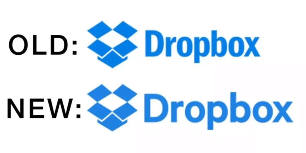
Transitioning from a file storage service to a collaborative workspace, Dropbox’s rebranding effectively communicated its expanded offerings. The updated logo and user interface reflected the company’s evolution and appealed to a broader audience. Their rebrand introduced a bold color palette, a geometric logo, and a new tagline: “unleashing creative energy.”
This branding refresh laid the groundwork for their March 2018 IPO. The new identity repositioned Dropbox as a workspace solution, not just a digital locker.
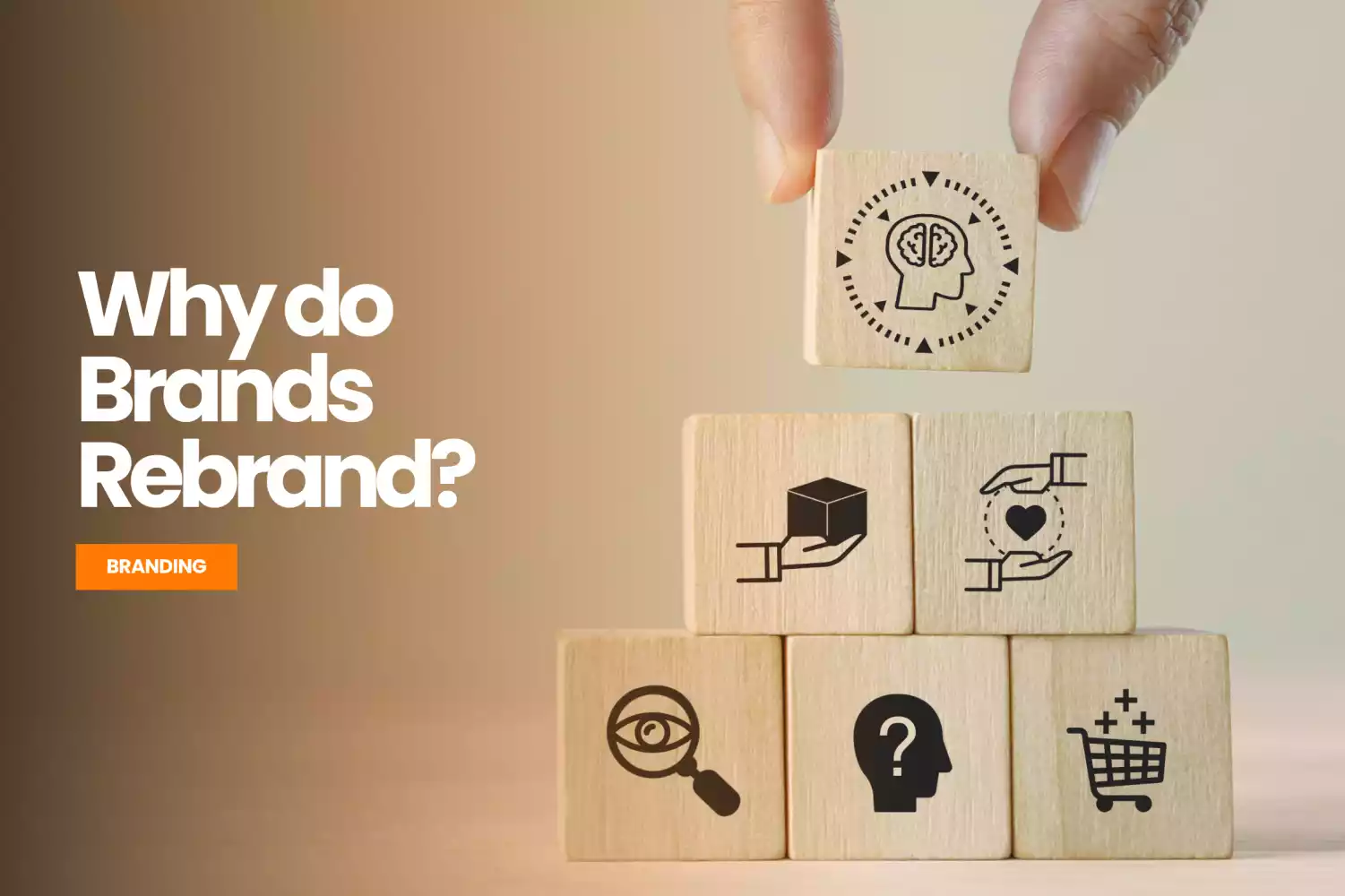
The Framework: Purpose Over Panic
These examples underscore a critical divide:
- Purposeful rebrands (Dunkin’, Dropbox) evolve with business and resonate with customers.
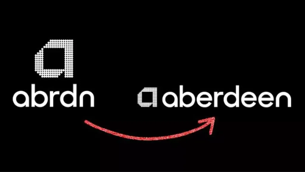
- Panic rebrands (abrdn, Gap) chase aesthetics at the expense of alignment and clarity.
The Framework: Purpose over Panic
Rebranding, at its best, is a tool to tell a sharper story about who you are and where you’re going. At its worst, it’s a costly exercise in vanity. So how do you tell the difference?
A purpose-driven rebrand is deliberate. It aligns with business strategy, reflects a real shift in vision or offerings, and respects audience connection. Think Dunkin’s evolution into a beverage-first brand or Dropbox’s pivot from file storage to creative collaboration. These are examples of brands using rebranding to strengthen their relevance and open new chapters without alienating the audience.
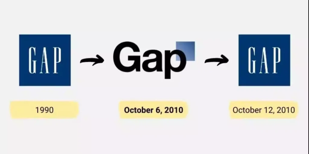
On the flip side, a panic-driven rebrand is reactive. It often emerges from internal pressure to “modernize” or from fear of being left behind. Abrupt design changes, trend-chasing, and poor communication are hallmarks of this approach. Gap’s overnight Helvetica experiment and abrdn’s vowel-free gamble show how these efforts can confuse audiences and dilute equity.
This framework is a gut check for brands:
- Are we solving a real problem?
- Does this reflect who we are becoming or just who we wish we were?
- Are we inviting our audience along or springing a surprise?
When the answers aren’t clear, the rebrand probably isn’t ready.
Market Trends and Consumer Insights
Understanding current market trends is crucial for effective rebranding:
- Consumer Trust: 81% of consumers need to trust a brand to consider buying from it. 10-20% of marketing budgets are spent on branding and rebranding by most companies.
- Visual Identity: 55% of brand first impressions are visual, emphasizing the importance of design in branding.
- Social Media Influence: 77% of consumers prefer shopping with brands they follow on social media, highlighting the role of digital presence in brand perception.
Effective Rebranding Strategies to ensure a successful rebrand:
- Conduct Thorough Research: Understand market trends, audience preferences, and competitor positioning.
- Engage Stakeholders: Involve employees, customers, and partners in the rebranding process to foster buy-in.
- Maintain Brand Essence: While updates are essential, retaining core brand values ensures continuity.
- Communicate Transparently: Clearly articulate the reasons for rebranding to avoid confusion.
At Crewtangle, we specialize in crafting bespoke rebranding strategies that align with your business objectives and resonate with your target audience. Our approach combines market research, creative design, and strategic planning to deliver a brand identity that stands out.
So, if your brand’s ready to move forward but feels held back, maybe it’s time to look at it again, this time with new eyes.
Let’s collaborate to create a rebranding that not only looks good but also drives results.
-
Content that rocks the world
06 November, 2020 -
Design: Bringing Ideas to Life
12 November, 2020 -
Whassup Bud: One of Budweisers’ Evergreen Television Ad Campaign
20 November, 2020 -
Brands must be Gods
27 November, 2020 -
The Deffective Dictionary
08 January, 2021