Handeez is a personal care brand catering to women and babies, with a portfolio spanning pregnancy kits, baby wipes and baby creams, with plans to expand into broader skincare. As the brand grew, it needed an identity that could evolve with its expanding portfolio while building stronger emotional relevance with consumers.
The Brief
The brief was to create a cohesive, modern and premium brand identity that could bring consistency across Handeez’s existing products while creating a strong foundation for future category expansion. The identity needed to balance the trust and cleanliness expected from a personal care brand with a more emotional, warm and approachable personality.
The Challenge
Handeez’s existing logo and packaging had been developed across categories without a unified brand system. This resulted in inconsistencies in visual language and limited the brand’s ability to build recognition. With the brand preparing to enter broader skincare categories, there was an opportunity to move beyond a functional product identity and establish Handeez as a holistic personal care brand built around care, ease and love.
The Solution
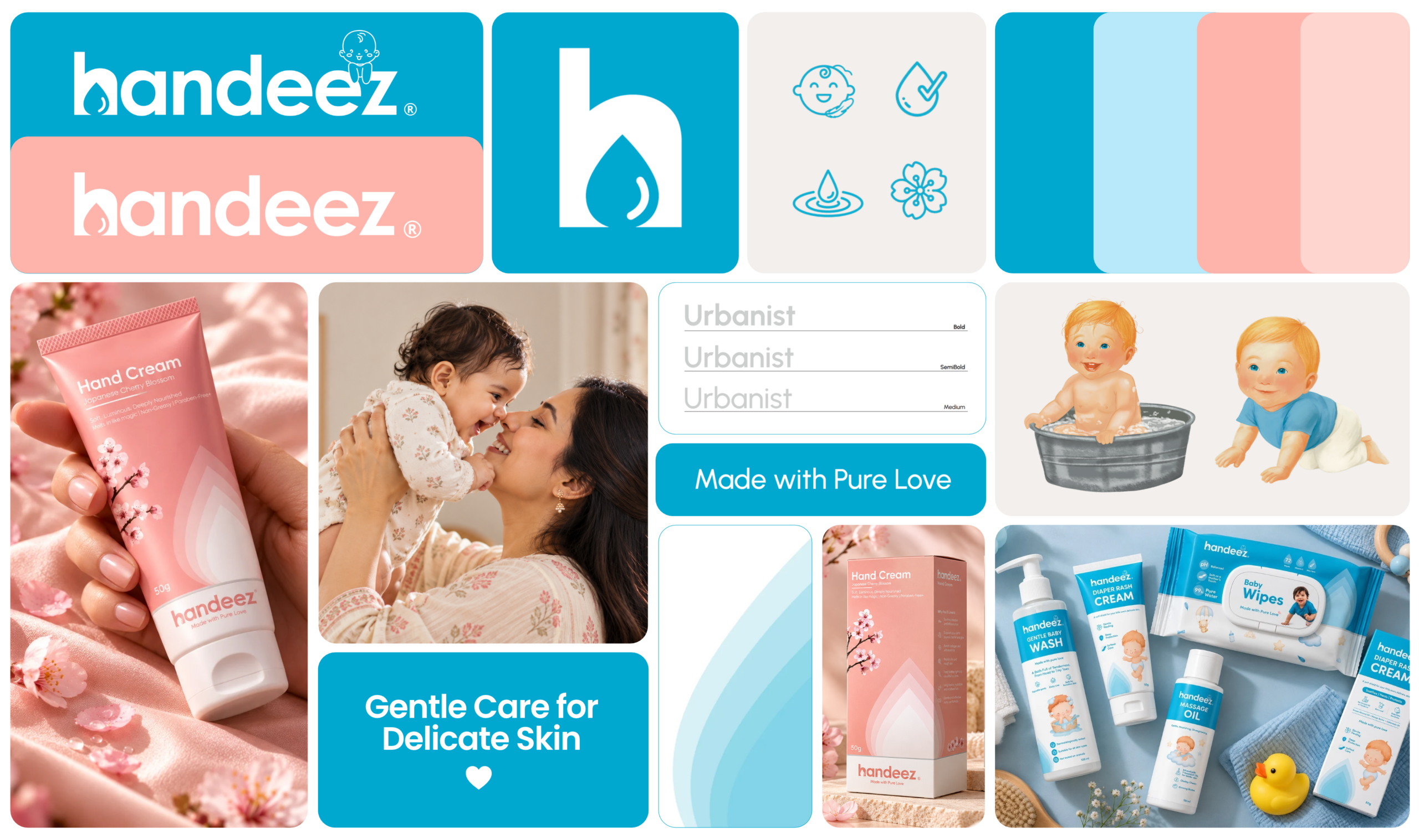
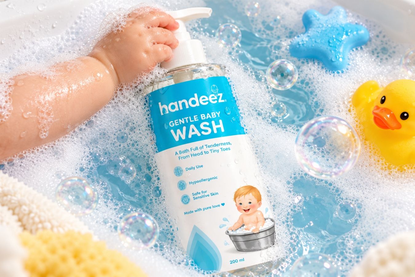
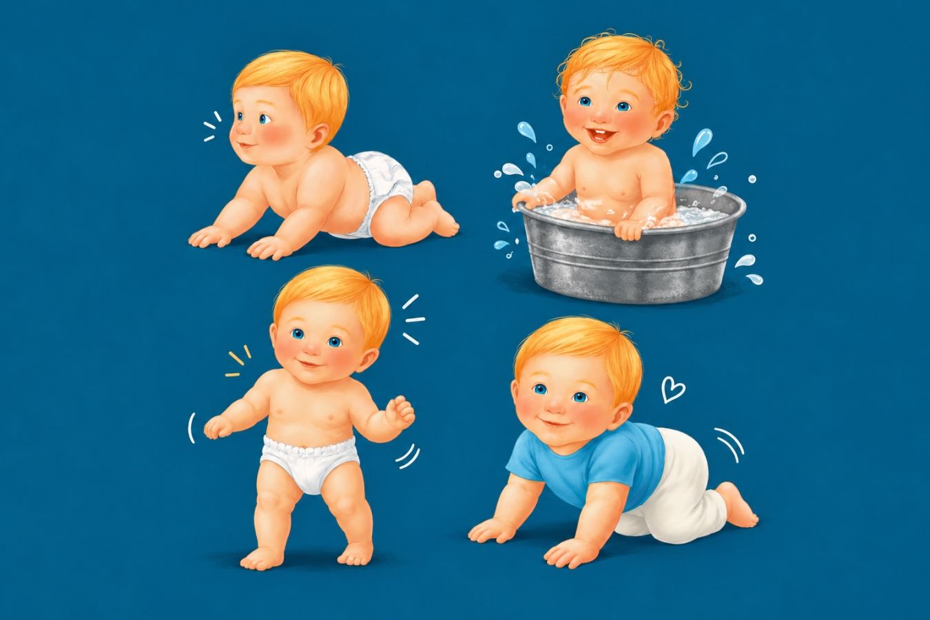
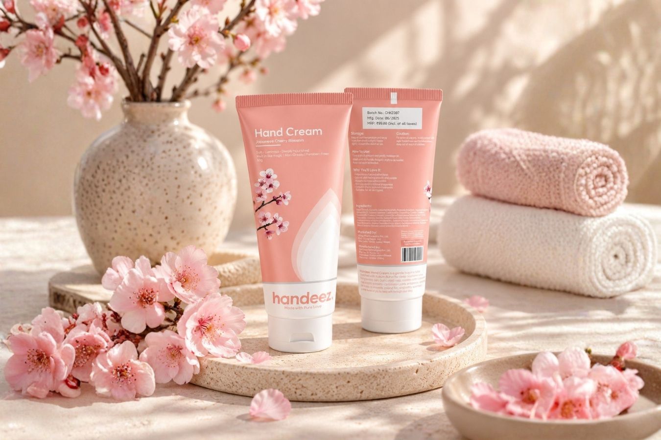
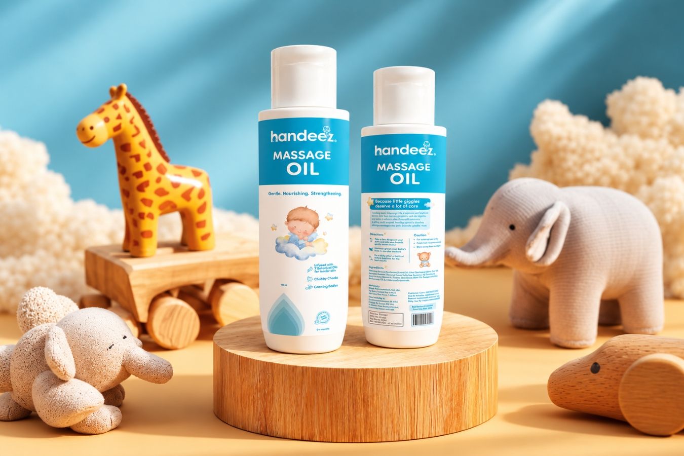
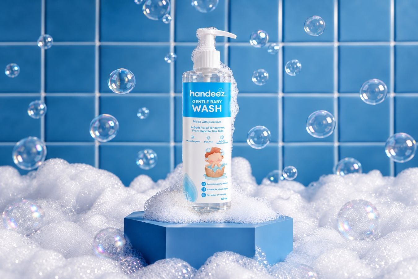
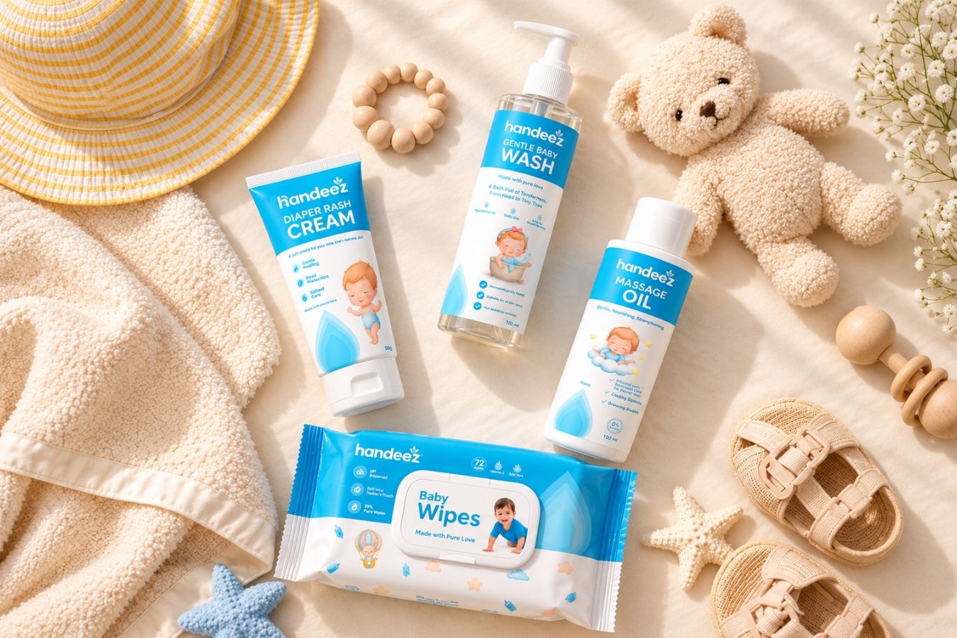
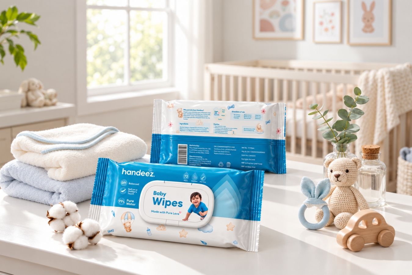
Crewtangle began with an audit of the existing logo, packaging and brand collaterals to identify gaps in consistency, communication and scalability. The key insight was found in something common across the entire portfolio—water. This became the foundation for the new visual identity, with the drop introduced as a central brand element. The logo was redesigned around the drop, symbolising purity, nourishment and hydration. Rounded typography added softness and accessibility, while the signature blue reinforced trust and cleanliness. The identity was anchored by the tagline “Made with Pure Love”, shifting the brand narrative from functional hygiene towards emotional care. To bring this emotional positioning to life, we also created a baby mascot as a distinctive brand character. The mascot was sketched and developed in four different poses, which were then integrated into the packaging. This gave Handeez a warm, playful and recognisable visual element that directly connected with its baby-care audience. A scalable packaging system was developed to bring consistency across the portfolio while allowing individual products to retain their own identity.
Results & Impact
The rebranding transformed Handeez from a fragmented, functional product label into a more cohesive and emotionally-led personal care brand.
The new identity created greater clarity across the portfolio, strengthened visual consistency and established a scalable foundation for future product and category expansion.
The combination of the drop, baby mascot, colour language and packaging system gave Handeez a distinctive visual identity that balanced trust and purity with warmth and emotional connection.